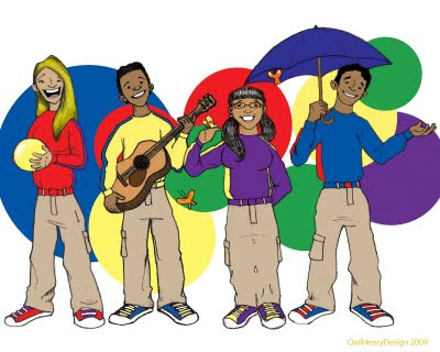
So first thing I like to do is grab some pictures to draw from. One of the guys on the show- Bayardo- is a friend of mine, so, with his permission, I lifted a few pictures from his Facebook profile:
 That's him on the right. Then I make a sketch that's as true as I can make it to the picture I'm drawing from:
 I'm working fast, so it's not crazy true to life, but I'm making an attempt to capture as much of his likeness as I can, and I'm getting a sense of what makes Bayardo's face distinct. I like B's chin- it's definitely distinct- and his face is longer, his eyebrows more defined, than the other male actor's. These aren't the only differences, of course, but my end product won't be all that detailed, so I just need a few keys.
Now it's time to approach the final drawing. I took a picture of myself in the pose I want for the drawing- I decided B would be holding an umbrella:
My picture includes my whole body, and it's hi-res enough that I can zoom in to look at areas I want to focus on. Then I draw the sketch for the final:
 Then I scan it in to Photoshop and clean up the lines- I want them clean and dark, but I want to still get a sense that they're hand-drawn, that a pencil was involved at some point in the process. Sometimes I'll ink them and convert them to vector lines with Illustrator, but I wanted something rougher on this:
 With this design, I can easily take out the white areas and replace them with colors, then add a background and I'm done:
And the final group shot:


No comments:
Post a Comment