
I'm a huge fan of artists posting articles on how they made their stuff - I don't have a lot of formal training, and I always learn something new. So, here's how I made this thing.
I usually start with an idea floating around in my head. Sometimes it takes weeks or months or even years to actually sit down and force it onto a page - it's like being pregnant and finally giving birth, except I can choose when to give birth, so I usually put it off 'cause it can be kind of painful.
Sometimes I'll make an initial sketch, just to make the composition clear, but this time I knew exactly what I wanted, so I started by gathering imagery. I knew I wanted to make an image of a kind of devilish Red Riding Hood surrounded by wolves, her cape swirling all around her. Somewhere along the line I saw the cape as a big watercolor swirl, so I could draw the girl and the wolves and layer the red paint in underneath.

James Jean starts his pieces with blue pencil sketches. I've been doing this more and more recently, and I find that though it adds another step (and thus extra time) it provides a kind of softer, less committed beginning - I can make mistakes and fix them more easily. Here's the blue pencil sketch:


I then use a graphite pencil to clarify the decisions I've made with the blue. You can see the second wolf has been voted off the island. This process is my least favorite part - the closer I get to permanence, the more uncomfortable I become. Using pen is a process I've almost completely dismissed lately. But pencil's a bit more forgiving. I'm also using this great paper that was given to me for Christmas - I have no idea what it is, but you can erase the HELL out of it, and it doesn't get worn out.

I listen to music or watch movies I don't need to pay a lot of attention to when I'm working, and when I'm looking at the piece later on, I get an echo of what was going on in the background. This piece reminds me of the movie Poltergeist, for no other reason than when I was coloring it in Photoshop, I was also watching that movie.
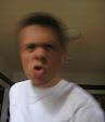
An interesting side-effect of modeling the girl on a picture of myself is that her general appearance is slightly more mannish than it should be, which adds to her predatory feel in an almost subconscious way.
Another technique that I got from Mr. Jean is masking the original black pencil lines with different colors, which is most evident in the pink lines around the ribbon; I also used it in some of the lines that make the cloak. It's a small detail, but I think it makes things look slightly more professional, though it was surprisingly hard to commit to; I usually leave the lines black.
The forest background was added at the last minute and I think it looks pretty sweet - now I know what that leaf-shaped paintbrush is for!
This design is available for purchase! (All your dreams are real!) T-shirt available or you could even get a poster! Go for it!!
No comments:
Post a Comment